Your Cart is Empty

FURNITURE


The Soft Side of Fall - A Pastel Color Palette for the Season

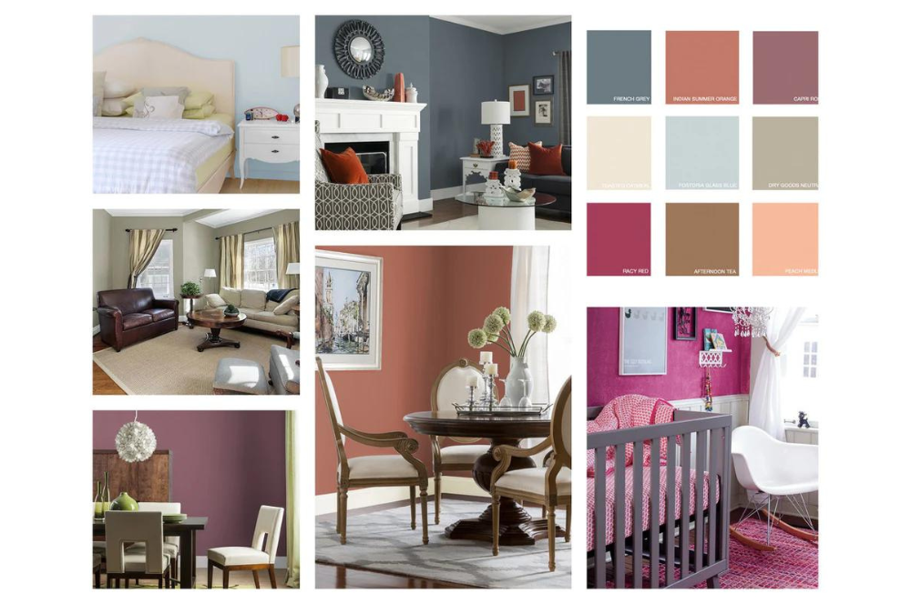
Earlier in the year we posted a selection of rugs to go with the Pantone Spring color collection. Now, as we move into Autumn, a post by Melissa Michaels on the My Colortopia Blog inspired us to pull together a set of complementary rugs to go with the Glidden colors for Fall 2015.
Take Autumn in another color direction - Soft Pastels for Fall! So often Autumn is associated with those deeply saturated golds, oranges, rusts, and browns. This palette is a nice departure and offers a wonderfully fresh decorating option. Which do you like best?

This contemporary striped rug by Jaipur works with French Grey, Fostiria Glass Blue & Toasted Oatmeal:

Serenity by Karastan would combine well with Fostiria Glass Blue, Afternoon Tea & Dry Goods Neutral:

The overall coral tones make this rug by Momeni is a good choice for Indian Summer Orange, Dry Goods Neutral & French Grey:
An attention grabber, this handwoven rug would combine well with Racy Red, Capri Rose, or Dry Good Neutral.
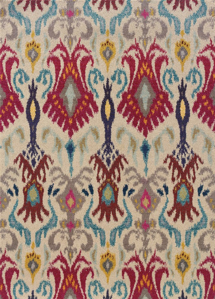
Kaleidoscope, from Oriental Weavers is a sure-fire way to go for Racy Red:

Pretty Brio coordinates well with Indian Summer Orange, Afternoon Tea & Peach Medley:

Bonus: Another Kaleidoscope by Sphinx (Oriental Weavers) will pretty much be a hit with any of the colors in this palette:
Whether you choose to keep with the soft pastel or go with something bolder, this palette is a sure winner. These are just a few of the many options to choose from if you decide to paint with one of these Glidden colors. Which is your favorite?
