Your Cart is Empty
RUGS
FURNITURE
5 Favorites With Tips That Show You How to Get The Look

So many channels, so much surfing... rough job, right? Today's favorites come from Instagram, Houzz and HomePolish. Instagram is great because many of the photos are in the moment, shot from the hip, artsy style. That's a refreshing change from some of the high polish of styled photos. There needs to be a balance in our sources for inspiration. That way you stay fresh and diverse in your overall design sense. Which is your favorite from this bunch?

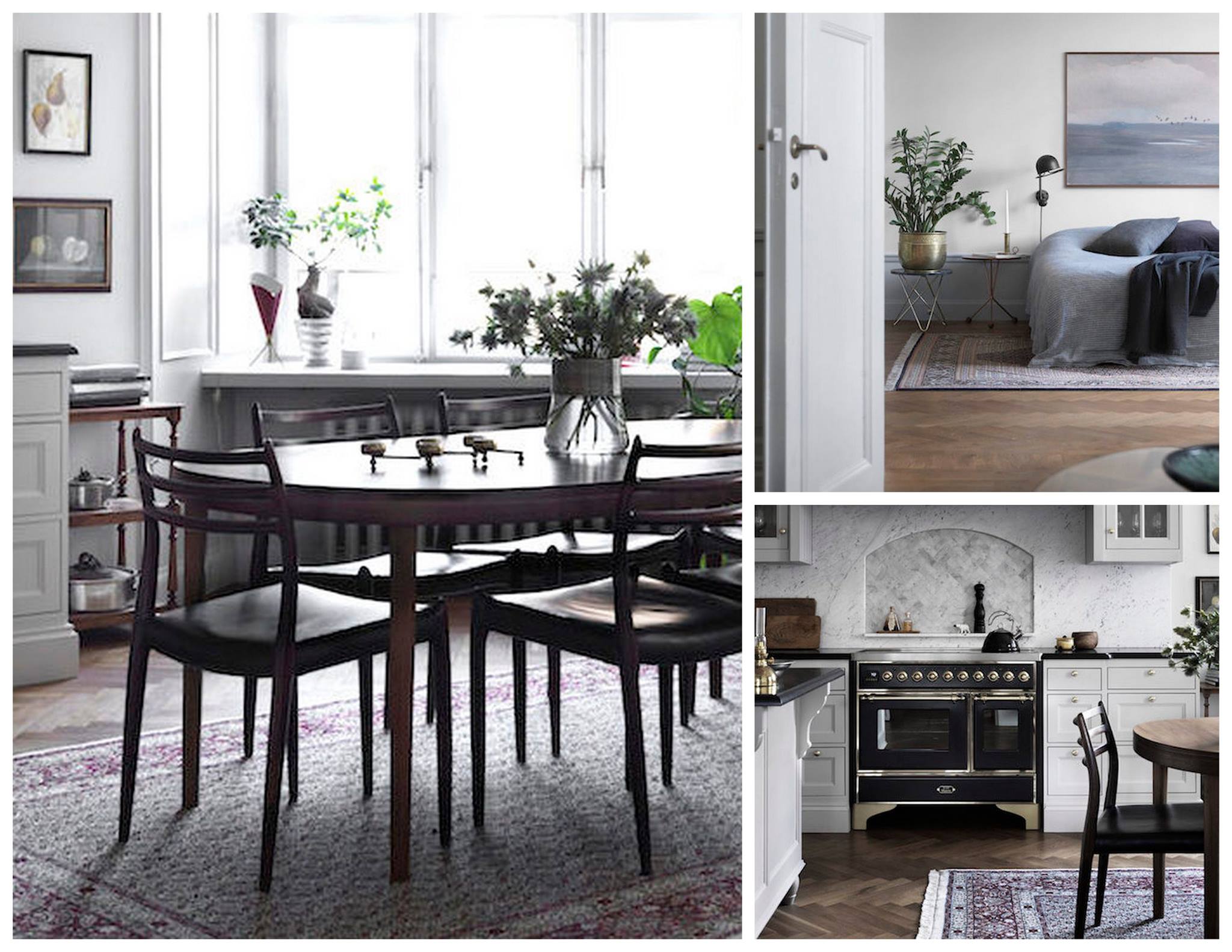
We have been talking about how the mix of older traditional and tribal rugs works so very well with modern furniture - mainly because it is such a high contrast and that creates visual appeal. This is one of those sure fire design tips.
In a neutral or monochromatic space adding a little visual interest with a rug gives the room some depth and visual texture amidst the overall palette, where without contrast everything blends together making it difficult for the eye to land and enjoy.
Photo by Lisa Borgnes Giramonti
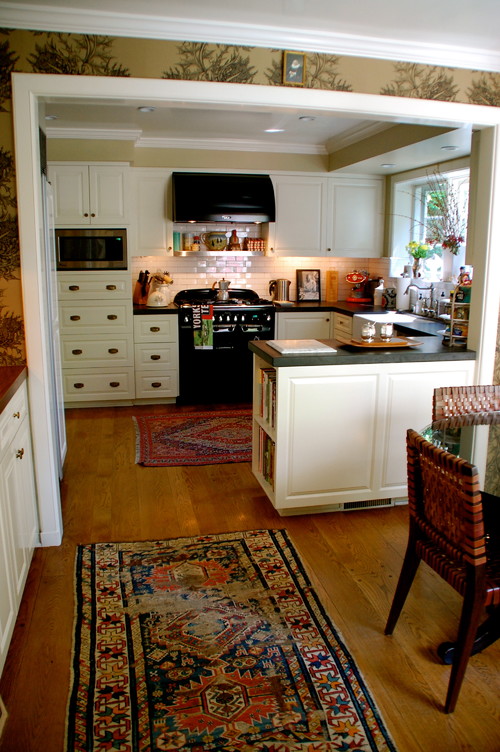
The great thing about one-of-a-kind rugs is that you can mix and match however you'd like because each is a work of art that stands on its own. It's their beauty and uniqueness that make them go well together, not their color or pattern.
Photo by Eskuche Design
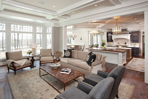
Pull it all together with the rug. They couldn't have found a better match, right? Notice how the rug makes the space one cohesive design statement. Great look!
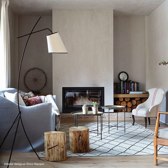
Mix it up. Combining elements from different styles is a sure way to create a look all your own is rooted in things you love rather than things that "go together". If you consistently choose things you love they will naturally go together because your eye is usually drawn to things that share similar features but don't look the same. Trust yourself and go for what you love rather than what you think you "should" do.
