Your Cart is Empty
RUGS
FURNITURE
Accent with Beauty: How Decor Accessories can Improve Your Design

Richmond M8020K by Oriental Weavers
There’s plenty of information online about how to decorate your home. In fact, we recently published our own four-part series about how you can design an entire room from beginning to end. While many articles and blog posts talk extensively about how to choose bigger furniture pieces, select your color palette, or decide on a theme, there’s not as much information dealing with a commonly overlooked aspect of décor - the accessories.
When we say accessories, we’re referring to smaller décor items that are meant to round out or compliment a design. Some examples include drapes, cushions, tablecloths, wall art, etc. While you can make your accessories the focal point of your design theme, they’re more often used as accent pieces. They’re perfect for adding subtle hints of color or texture that can enrich your design in some surprising and wonderful ways.
Today, we’ll discuss some effective ways you can use décor accessories to improve your design. We’ll also share some best practices to help you use those methods to full effect.
Diversifying Your Color Scheme
One of the biggest mistakes you see design projects is getting the color wrong. In particular, bad designs tend to stick with a single variation color, leaving the room looking bland, use too many colors, or use colors that don’t mesh well together. Décor accessories can be the perfect way to diversify your color scheme, without going overboard with your palette.
A Study in Subtlety
In the image above the title, notice that the color scheme is very subdued and formal. It’s dominated by different shades of brown and cream. These soft colors are comforting and rich, and this room feels perfect for hosting a conversation after a dinner party or similar event. However, the designer has introduced some subtle color variations with their smaller pieces.
The flowers in the vase add just a splash of reds and yellows. The plant ornament above the fireplace, and the unique but very interesting choice to put some plants in the fireplace, round out the palette with green. They also tie in nicely with the foliage seen through the window.
Neither of these elements overwhelms the color scheme. They just alter it slightly. Without these accessories, the room would run the risk of looking too plain. This effective design proves that even small pieces can have a big impact.
Use the Color Wheel to See What Works
If you choose to diversify your palette with your accessories, you do need to be careful. It may not seem like it, but even a small burst of color can throw off the whole design. Anytime you need to determine what might work and what won’t, reference the color wheel before you make your selection.

To Emphasize Your Style
One of the most common and effective ways to use your décor accessories is to reinforce the style you’ve selected for the room. Décor accessories don’t have to always match your main pieces perfectly. However, choosing pieces with similar colors, textures, and patterns can be a wonderful way to add some variety to your room while maintaining unity in your design.
Determining Shared Elements
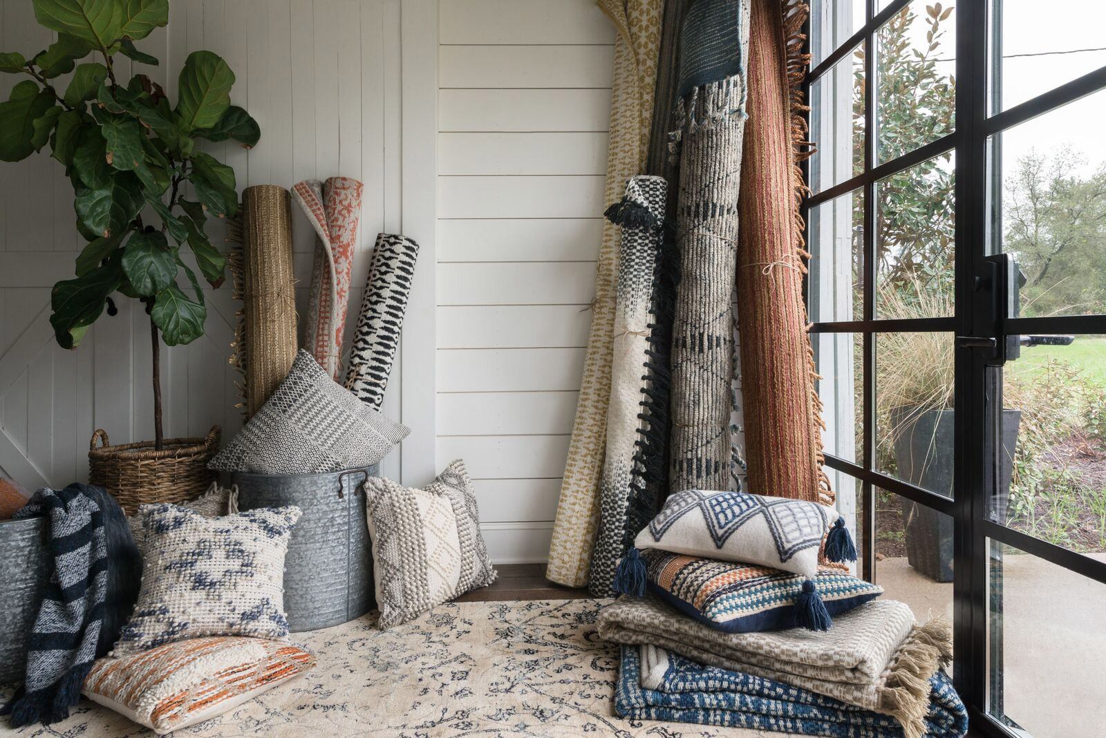
When you look at the Magnolia Home Rugs Collection by Joanna Gaines, there are a few common motifs that the collection emphasizes:
- Softer, subdued colors
- A hand-woven appearance
- Predominantly natural fabrics like wool and cotton
- Engaging patterns with a simple foundational shape
- Soft, inter-woven textures
- A homely, traditional look
Joanna has always based her designs on creating a timeless look. These rugs are no exception. Their beauty is in their simplicity.
Now, take a look at the magnolia home decorative pillows that we feature. They match the style of the rugs in nearly every way. However, there’s just enough difference to create some variety. The pillows’ textures tend to be more pronounced, and their patterns tend to be a little more varied. But they still match the Magnolia Home motifs that Joanna has used to great effect.

Adler AW-04 Ivory by Loloi
The Key to Style Success
Your décor accessories can help to reinforce the style of your larger pieces, even if they’re not exactly the same. The key is to determine the common design motifs in your main pieces and find accessories with similar trends.
Creating Contrast with Texture
As I mentioned earlier, you can create an effective design with accessories that don’t perfectly match your main pieces. Color selection is one example, but you can use different textures just as effectively.
Achieve Variety with Harmony
In the photo above, you can see there’s a clear contrast between the recliner and the area rug beneath it. The chair is sleek leather, very smooth, and has a bright sheen that reflects light brilliantly. The rug looks very soft, the elevated fabric lines give it a more textured appearance, and it absorbs light. These two pieces couldn’t be more different, but they work together beautifully. Why is that?
Use Textures that Match Your Theme
They may be different colors and textures, but they both fit the overall theme of the room. The palette is based in browns, creams, and greens. Both of these pieces fit within that color scheme. Additionally, it’s clear that the purpose of this space is to encourage relaxation while keeping a luxurious air. As a furniture fabric, leather has always associated with luxury, so the recliner fits that theme. The rug has an elegant design, but you’d be perfectly fine curling your toes on the soft fabric.
While the textures between the pieces are completely different, the overall theme is the same. Whenever you choose to create variety with textures, focus on the theme and purpose of your room, and use textures that fit that theme.
Balance the Scale with Accessories
Achieving consistency with scale and proportion is one of the hardest things to do in design. The size of your space, your furniture pieces, and your accessories all have a role to play in creating a balanced look. If any of these elements don’t blend well together, the entire design can fall apart.
The Difference in Scale and Proportion
Many people confuse the terms scale and proportion. The Spruce published an excellent article on scale and proportion in interior design that explores the topic very well. They clarified that scale refers to how items compare to the size of the room and other objects. Proportion refers to the shape of an object, and how it compares with others in the room. You have to balance both aspects if you want a coherent design.
Finding Harmony in Size
When you’re trying to balance the scale and proportion of your room, start by looking at your room and gauging the overall scale. The bigger the room, the larger the pieces you need to use. Conversely, if your size is limited, don’t use big pieces. You’ll quickly eat up your space, and the room will look cramped. With large spaces, don’t rely on quantity to achieve your look. That can take up white space and create a cluttered appearance.
Whatever size your main furniture pieces will be, your accessories need to match them. For example, if you have a large living room, with a sectional as your centerpiece, a tiny coffee table would look silly. At the opposite end of the spectrum, a massive framed painting will look completely out of place in a tiny sitting room. This applies to any patterns you incorporate as well. Use large patterns for larger rooms, and vice versa.
Arrange Your Accessories to Emphasize Mood
A final factor to consider with décor accessories is in how you arrange them. Whatever theme or mood you want to set in your room, your accessories can help to emphasize those feelings. The goal here is not to make your accessories the center of attention, but rather to heighten the ambiance of a room.
Arranging Shapes
If you want to create total unity, use shapes of a similar nature in your design. For example, if you’re using a rectangular coffee table, you could also use rectangular photo frames and end tables. This will foster a sense of order. Alternately, you can use different shapes to introduce a sense of artistry. Rectangular tables paired with oval mirrors or wall frames run the risk of looking chaotic, but can give the room a unique air.
Working with Angles
If you want a neat and orderly appearance, then your accessories have to line up perfectly. For example, you could hang three different paintings in identical frames at the exact same height, running in a straight line from left to right, or up and down. Some people find this boring, so if you want to give a more unique impression, place your accessories at different heights and angles. This is especially effective when you hang photos or wall art.
Accessories Add Just the Perfect Touch
Just like with any other choice of décor, your accessories need to please you, first and foremost. As you’ve just read, there’s plenty of ways you can incorporate accessories in a way that isn’t overbearing. The key lies with you, your tastes, and the impression you want your room to create.
Thank you for taking the time to read this post, and I hope you’ve enjoyed it! We’re always happy to know that someone finds the style blog useful and fun to read. Take your time choosing and arranging your accessories. There’s a lot of options to choose from, so don’t rush into getting something that doesn’t work for you. Until next time, happy decorating!
